How to Learn from Your Improvement Data
Whether you’re just starting out on your improvement journey or an improvement pro, the best and simplest way to learn from your data is by looking at it on a run chart. Run charts help to better understand and visualize our data points and how they change over time. Change over time is what tells us whether our system is improving or not, so it’s important we monitor it frequently.
We recently wrote a blog about learning from variation in time series data. We can see in the chart below that the data points move up or down to show changes in energy consumption —this is what variation looks like. (This is from our recent blog about learning from variation, check it out here if you missed it!)
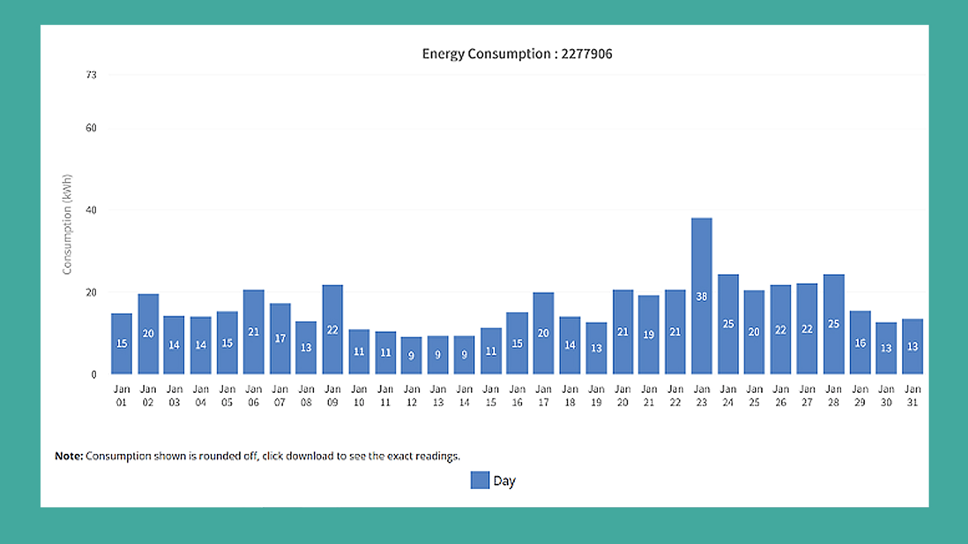
With normal (or random) variation, we should see about half of data above or below the median line, which is the mid-point across all the data points.
However, using a run chart, it’s easy to see when variation falls outside of normal values.
When carrying out PDSAs to test different ways to change your process or system, we can look for signals (or non-random variation) in our data. These signals help us to see if the changes we are making are producing the intended outcomes.
Two of these signals are shifts and trends.
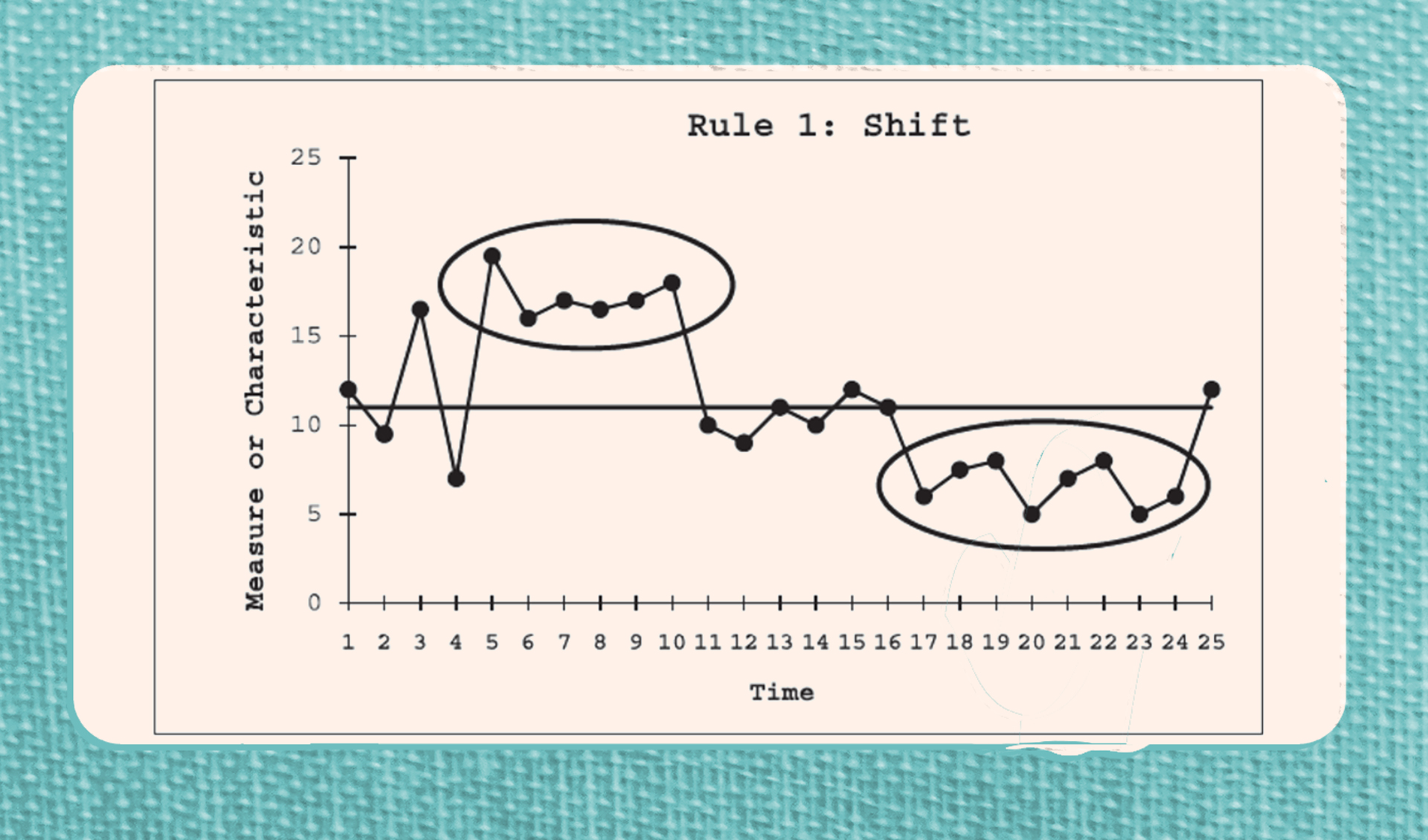
A shift is six or more points that are either all above or all below the median line as you can see in the run chart below.
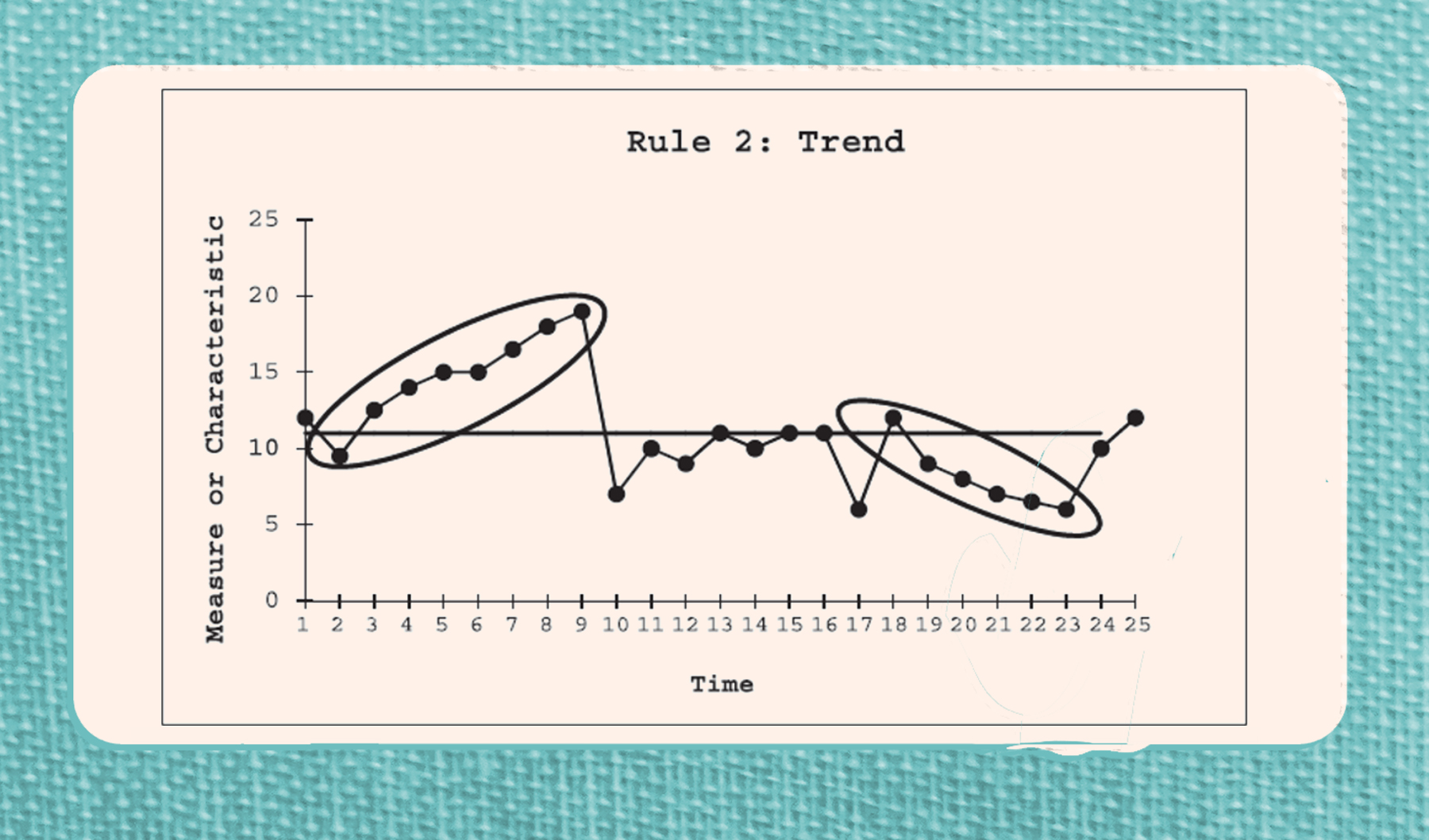
A trend is five or more consecutive points going either up or down on your run chart, regardless of if they are above or below the median line. You can see two trends in the chart below.
Shifts and trends in the direction of the desired change show progress toward your aim, while points moving away from your goal can indicate a challenge or factor that is impeding progress. That means not all positive trends mean improvement and not all negative trends indicate disaster—the data must be understood in relation to your goals!
Let’s practice with the run chart below, tracking the number of unresolved emails of one team member over two months.
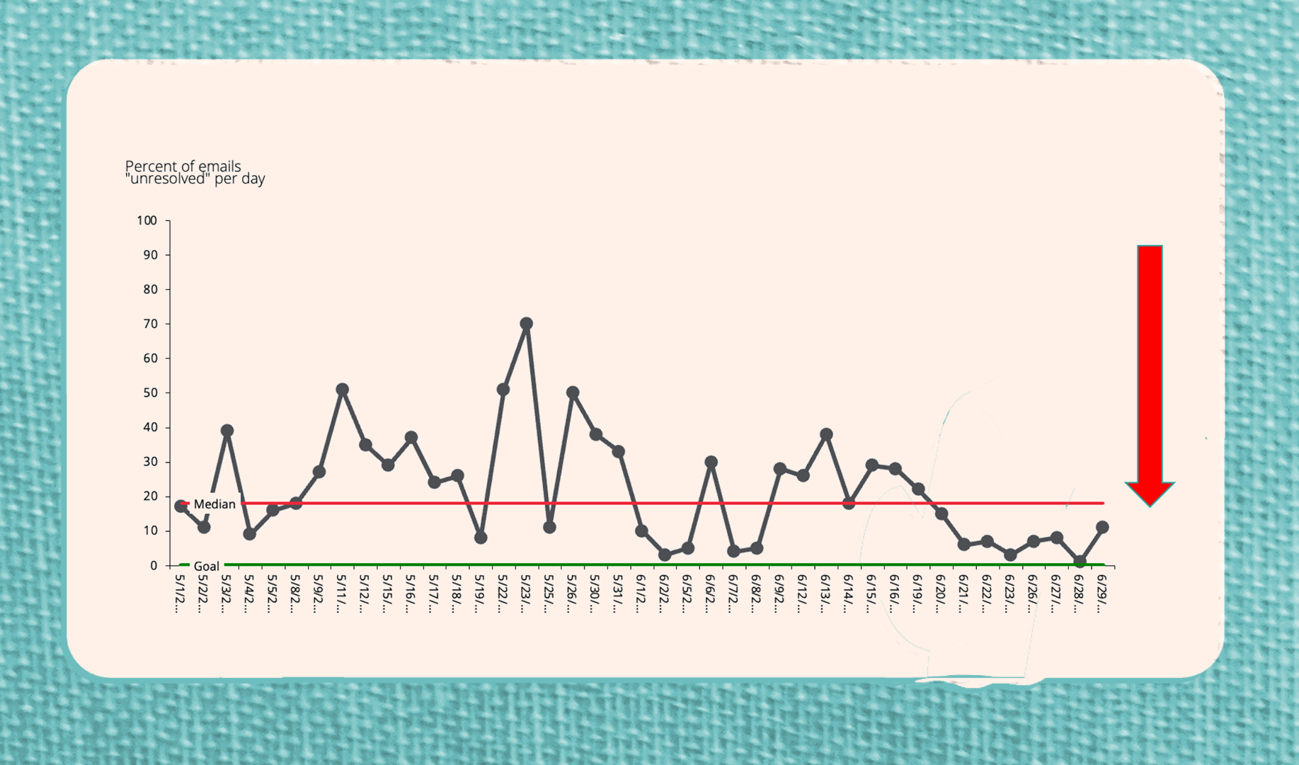
By looking at this chart we can see that the median is 19% of emails unresolved and the goal line is set to 0%. On run charts, it is also helpful to indicate the direction we’d like to see the data points go (the red arrow). In this case, we’d like the percentages to decrease.
For this exercise, let’s say that we do not know whether a team member has put any changes in place to move closer toward the 0% goal. On this run chart, 20 points lie above the median, 18 points below, and three points lie right on the line. While this may seem to indicate normal variation, looking for shifts and trends may tell a different story. To see if there is any improvement that may indicate the team member is attempting to improve their percentage, let’s check to see how many shifts or trends there are in this data.
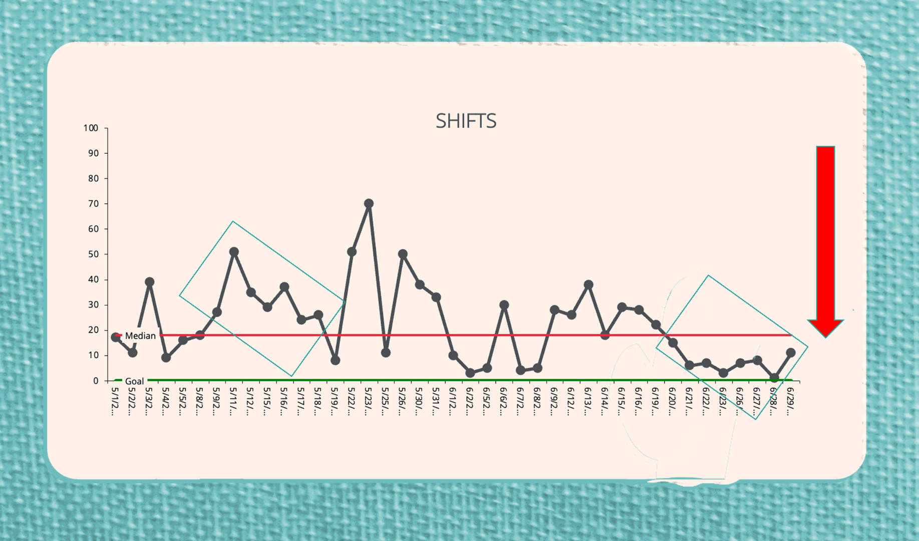
Looking at this data, we see that there are two shifts. One above the median when we began tracking and one below the median near the end. As these shifts indicate consistent movement toward the goal over time, we can say that nonrandom events are likely causing this change. For example, the first shift was likely due to being out of the office which is an important contextual factor to our goal. The second shift appears to be a significant improvement with not only consistently lower percentages, but also less variation between data points.
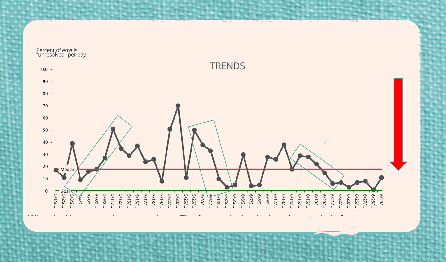
When looking at trends, we see three. The first, at the beginning of our period of measurement, shows a dramatic increase away from our goal. Again, this was likely during a vacation or busy conference period.The second trend demonstrates steady movement toward the goal but is not sustained. The third shifts and trends are strong indicators of nonrandom events - whether important context or a signal that changes you are making are having the intended impact. These are powerful and simple signals to help us to use our measurement to guide learning! We love these signals so much that we named our organization after one of them: Shift!
After you watch our video “Measurement for Learning.” The following links can also help you get started:
- Shift’s guidance on run charts.
- Institute for Healthcare Improvement’s Excel resource (Run Chart Template) for building a run chart (a free registration is needed to access).
- The article, Run Chart: a simple analytical tool for learning from variation in healthcare processes, is a quick and very helpful read!
- And one more! Understanding Variation with Run Charts
Please reach out to us at [email protected] if you want help setting up and/or learning from your charts!

